I’m asking if it is possible to insert on Graph performance window a new curve with below info.
I would like to to plot the performance of my portfolio in reference to profit (capital gain) vs. invested capital . I have done this simple calculation by Excel. I extracted from “Statements of assets chart” two column in excel . One is for “Delta (since first transaction)” , second is for “Invested Capital (since first transaction)”. I have done simple calculation Delta/Invested Capital in %. It is done line by line, it means day by day. In my opinion it is interesting for investor in order to understand the real progress of profit in %.
It it just ready to use? If no, can you introduce?
Such a data series isn’t available, and it doesn’t make sense, either.
The value will rise immediately when money is withdrawn, because that reduces the invested capital while leaving the delta unchanged. And just imagine what happens when the invested capital becomes negative, or even zero (or close to zero).
Unfortunately my competence level is low and I don’t understand your explanation. Your software is very good and it has many different possibility to use. From other side I think ( but I can be wrong ) my request is very simple to insert.
" … invested capital becomes negative, or even zero (or close to zero). … " . Time zero , you start to place a new portfolio. For me the meaning of “portfolio” is a set of financial instruments ( stocks , bonds, ETF … ). On this time you invest first capital to buy the financial instruments . During the history of this portfolio you will add new capital ( spend money to buy and increase the value of financial instruments) or sell part of existing portfolio. Invested capital will be never negative or zero because it means that the portfolio disappears. The invested capital is cumulative . Simple you divide the DELTA with “HOW MANY MONEY YOU SPENT UP THIS DATA TO BUY INSTRUMENT” . In my opinion it has sense because you can se the percentage curve of your real earnings compared with money spent .
No. Assume that you invest 100 (invested capital 100), which then increases to 150 (invested capital still 100). When you now withdraw 100, you still have 50, but the invested capital is now 0.
I track this visually with Statement of Assets > Chart showing both Total and Invested Capital. A click on any date shows the values but not the index you want.
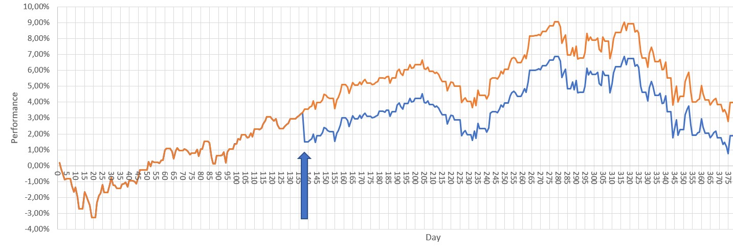
Dear All, I explain better what I would like to plot.
My portfolio is composted by 10 ETF , more or less 40% stock and 50 % bond 10% commodities.
At day 1 I invested X euro.
The performance in % of portfolio ( orange ) and the performance in % of Capital Gain / initial investment are the same ( blue ) up to day 137.
At day 137 I invested Y euro more . After this data my total investment will be = ( X + capital gain at day 137+Y) .
On day 370 I want to evaluate the graph starting from day 1 .
The performance in % of portfolio ( orange ) continues with its trend .
The performance in % of Capital Gain / total investment is different ( blue ) because ther is the second money immission (Y) .
I think I could be very interesting to have the blue graph