Moving average looks very strange (deliveries a problem?)

Hello everyone
Thank you for this great forum!

I have a question concerning calculations of “Moving average” as calculated by Portfolio Performance.

Consider below graph:

The moving average looks way off. Without moving average activated the graph looks correct.

I suspect it’s due to “Deliveries” inbound and outbound which seem to correlate with the dates messing up the average

Do you have any ideas if moving average simply doesn’t work correctly when using deliveries?

How do others put in “removals” and “deposits” in for example crypto where crypto is sent directly and received directly

How the question makes sense and is answerable!

Thanks in advance :slight_smile:

Thor

In 2017, you are selling before you bought anything.

1 Like

Amazing!
Thanks chirlu.
I think that did the trick. Did you see that from the first image?

It looks much better now

Yes, it can be seen both in the graph (red dot left of the first green dot) and from the list of transactions.

Ah!
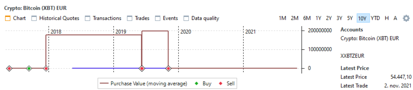
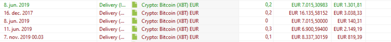
But I’m both buying and selling on the same day and the second list of transactions were only the deliveries - I also have purchases/sales :slight_smile:

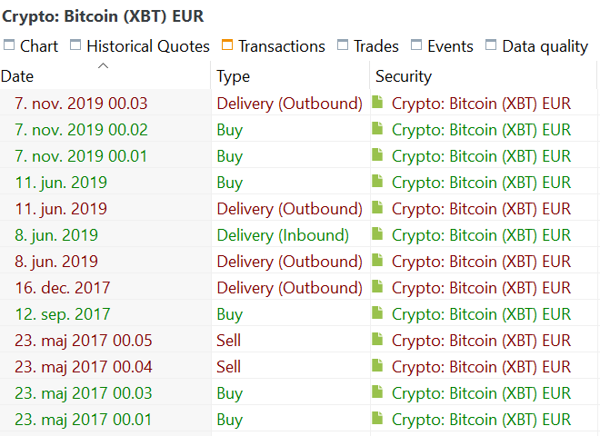
I changed the order (by using the seconds) to make it work. Specifically, I switched the order of the 23. may 2017 transactions

Below is the full list:
image

btw, those transactions that messed it up in 2017 were crypto-crypto transactions (which I put in as “crypto A to eur” and “eur to crypto B” pairs)
In either case. Thanks!