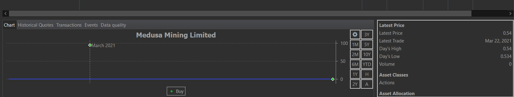
As you can see in the picture, I think there’s a problem with the scale in the graph that display the evolution of stock price + buy / sell data with points (green or red), because the scale is not adjusted properly (it’s a stock with <1$ value)
The issue here appears to be the buy transaction around 1st March, which – I assume wrongly – has a price of around $ 95. The scaling is done to also show this transaction.
thanks, i wonder how I didn’t notice by myself ! (there was a missmatch in my first transaction with the conversion between my currency and the original currency of stock which is AUD…)