Hi everyone,
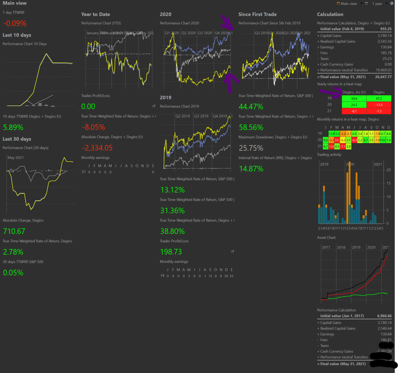
I have a hard time understanding the difference between Degiro (My securities account - yellow bar) and the chart Degiro + Degiro EU (Securities + Deposit account - blue bar). One represents the value of my investments and the other represents the value of my deposit account?
Just to shine some light - in february 2020 I sold a lot of my stocks that I slowly bought back in the next months. As you can see there is a big difference between the blue line and the yellow line. Is my assumption correct that if I left 1 stock that plummeted even further down it would be represented by the yellow line but because I sold most of my stocks it saved me from the drop (blue line)?
So the yellow line shows how my active portfolio is performing and the blue line shows how much money I made together with the initial investments?
Which is more representative of my portfolio value because I can’t wrap my mind around it. I know it is simple but I just can’t concentrate enough to understandand it.
Thank you
let’s assume your securities account is one single stock. The performance chart of a single stock is equivalent to it’s price chart. You have two different system boundaries: 1) single stock and 2) stock + deposit account. as long as you keep 1€ invested in the stock the performance chart of 1) will follow the price chart of the stock. in 2) however you have the performance of the stock an the performance of your deposit account overlapped. so the downward trend of your stock is cushioned by the money in your deposit account.
I hope this helps a bit.
I would name it this way: the yellow line is the performance of your investments and the blue line is the performance of your money. The difference between these lines can show how well your market timing was. A similar result you get get by comparing the IRR with the TTWROR for a 1 year time frame.
This depends on what you want to track. If you try to time your investment and go in and out of the market on a regular basis, then the blue line is the better performance indicator. If your deposit account is usually empty except for some transition times when you shift money from one investment to another I would prefer the yellow line.
In your above case, the blue line is a better representation, since you actively took money out of the market and use this to buy at a cheaper price again.
1 Like
Thank you for an amazing explanation! I think we can close it now.
Thank you once again!