I was looking for a tool to get some more details about my portfolio and i’ve stumbled upon this amazing tool. I’m a beginner and I’m pretty overwhelmed with all the possibilities that it offers. I’ve tried to look up beginner guides but I can’t find the answers I’m looking for.
I want to do two things:
Track performance of my portfolio as a whole and present it as a chart. Compare this with benchmarks.
I’ve decided that I want to spend 10% of my portfolio into seperate stocks and 90% into world ETF. Now it is fun for me to see if my hand picked stocks out or underperform the world ETF.
Now my questions:
So for example I buy Microsoft and Mastercard for €1000 each on 1 januari 2020, and then i buy €1000 Apple on 1 july 2020. I manually add these buys to my securities account. How can I compare these buys with as if I bought €2000 euro VWRL on 1 januari 2020 and €1000 VWRL on 1 july 2020.
Should I deposit on the same date that I buy stocks? Or just put a starting amount of 10.000 euro for example?
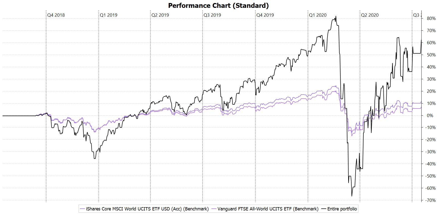
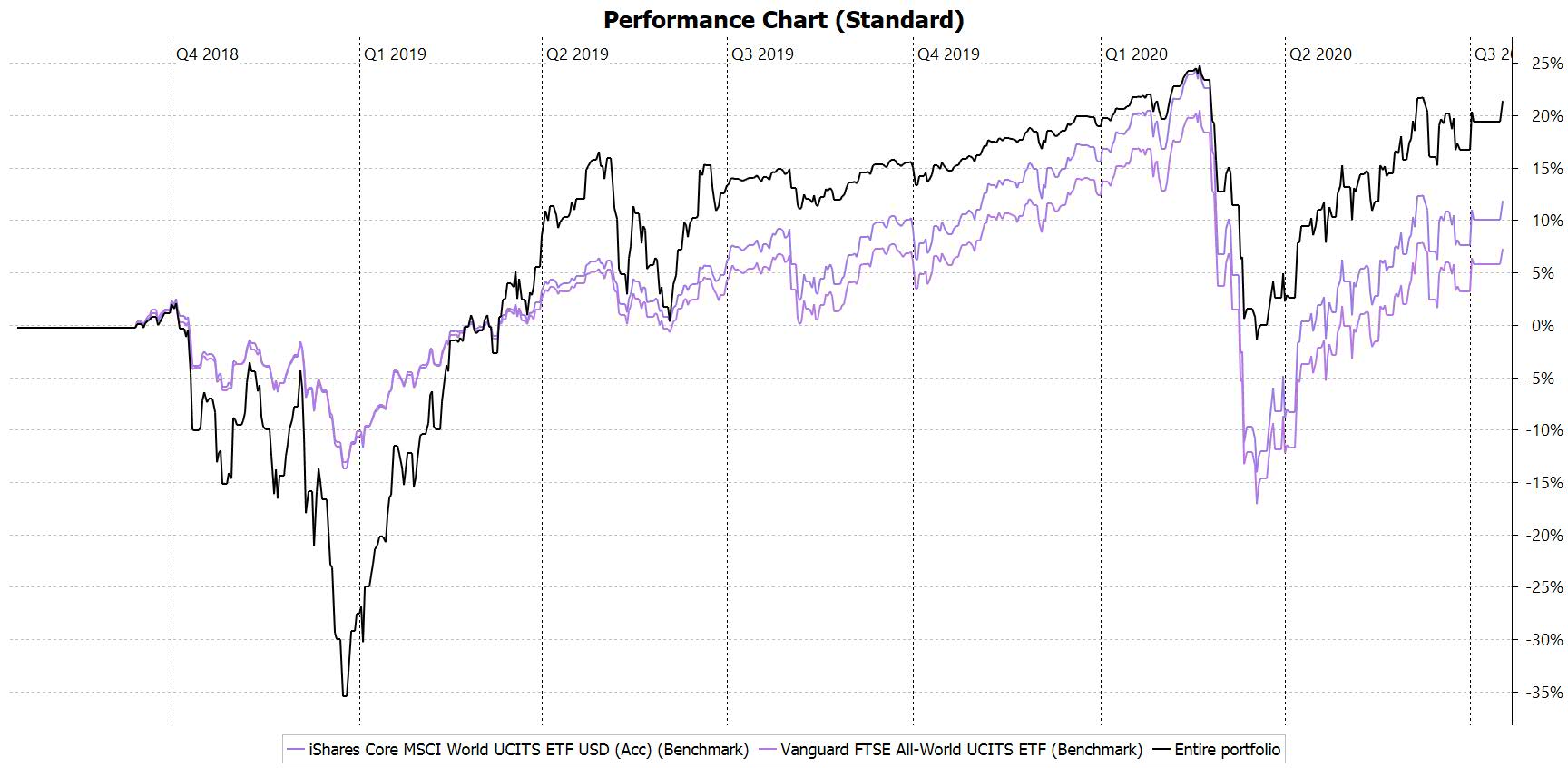
Below you see two charts. One where I have only entered stock buys with a negative account balance. And the second chart that shows a deposit in Q3 2019. Why do the graphs look so stranged compared to the benchmark and how can I do it correctly? The portfolio in this chart is 100% IWDA
small deposit at start 2018 (Account balance negative)
You can just make 2 separate securities account, one for your ETFs and one for your individual stock picks, and then filter them as individual chart.
Add data series > Stock picks security account
Add data series > ETF portfolio
Below you see two charts. One where I have only entered stock buys with a negative account balance. And the second chart that shows a deposit in Q3 2019. Why do the graphs look so stranged compared to the benchmark and how can I do it correctly? The portfolio in this chart is 100% IWDA
Your return includes cash deposits as well unless you filter them out.
@washingpole have similar situation, but I do not quite understand how can I see the performance of individual stocks in my portfolio including their dividends?
I would like to see if I have some underperfoming stocks in my portfolio like this.
sorry for the bump but I prefer to reuse a topic instead of creating a new one since my question is linked
One reply here was : “Your return includes cash deposits as well unless you filter them out.”
I do see that, and I’d like to change this (on the graphs too)
How do I filter them out ?
In my situation :
I decided to declare in the tool my corporate account in addition to other deposit accounts (CTO etc) because I like the idea of having a view of my entire patrimonium
problem is this business account holds quite a lot of money at the moment compared to my other accounts, so this mess up all my graph as it’s included everywhere
I’ve tried to deactivate the account but it does not do the job
So back to the beginning ““Your return includes cash deposits as well unless you filter them out.””