Hey team!
I don’t understand my performance chart and how to read it.
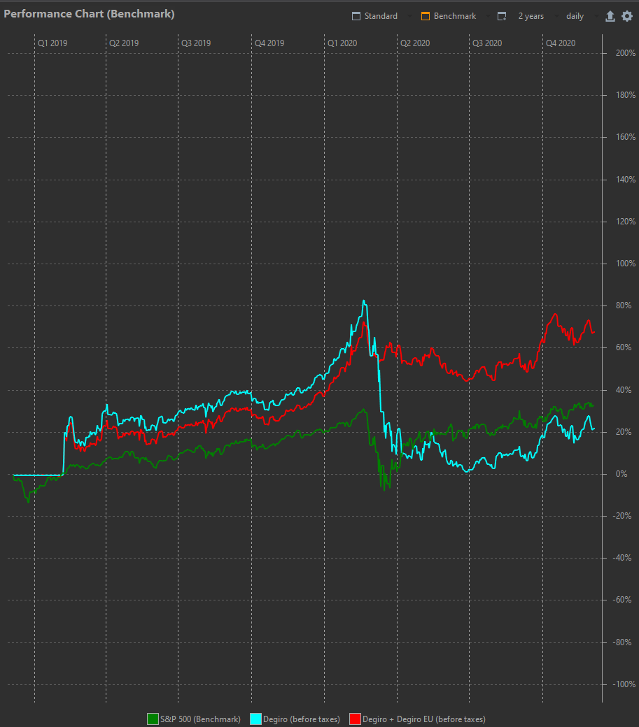
Some info:
Blue line - Degiro (before taxes) is the invested money in the brokerage account.
Red line - The Degiro EU+Degiro is the beforementioned invested brokerage coupled with cash that I keep in the same brokerage account.
Green line - Sp500
Questions:
-
I started investing in february 2019 and you can see the clear jump of the red and blue to +20%. Why? I didn’t make +20% of return my first day…
-
I sold all my portfolio in Feb-March 2020 and started reinvesting in April-March. I understand that that’s why there’s such a difference between Red and blue. Blue dipped to 0% because I liquidated my whole Portfolio?
-
Looking at the end of the graph - There is no way that I outperformed the sp500 so much. The red line is at +75% and it is just not possible. Overall I invested 20k and I’m +6,5k at the moment. This should be closer to +40%. The blue line on the other hand is at +22% which is too low.
Do you know how to compare my pf?
Thank you
