I have been using the program for several years and I love how it has evolved, its functionality and usefulness. I would like to make a suggestion that would make the program take a huge leap forward in quality, imho. I don’t know how feasible it is or how complex it would be to implement, but if it could be done, it would be a great success.
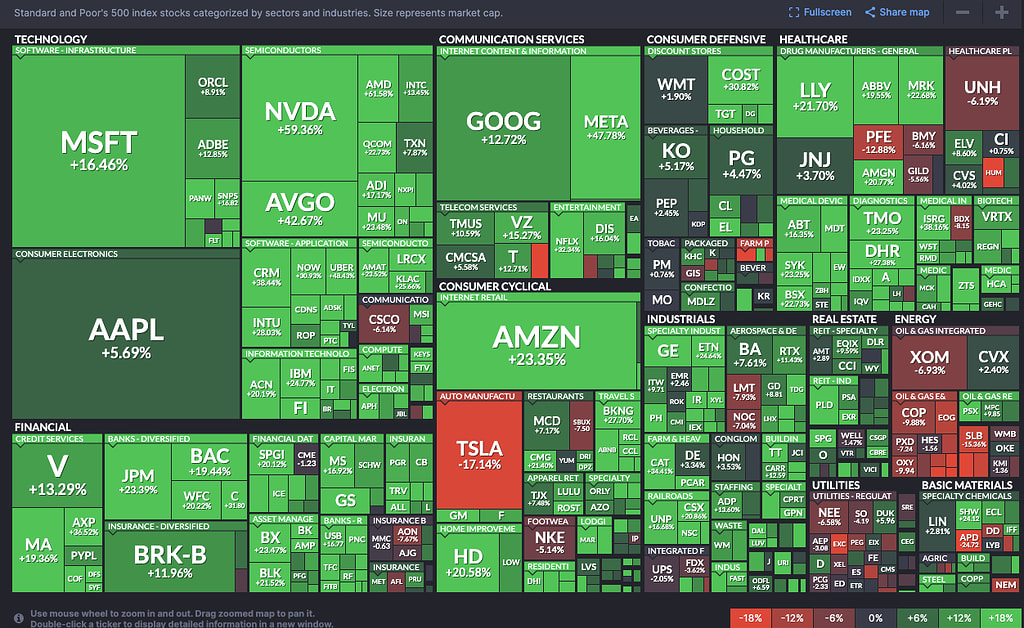
The suggestion is to add a tab to the program that allows you to view your portfolio as a Heatmap, exactly like Tradingview or Finviz, but with our portfolio, whether we have funds, ETFs or stocks. This would show the “price” of each security and its percentage increase or decrease for the day.
Yes, I have everything categorized, but that’s not what I’m aiming for.
I’m suggesting having a tab with a Heatmap as a full-screen display (not strictly necessary) to keep open and see something similar to the attached photo. This allows us to see how assets fluctuate and even see, by size, the weight of each one in our portfolio.
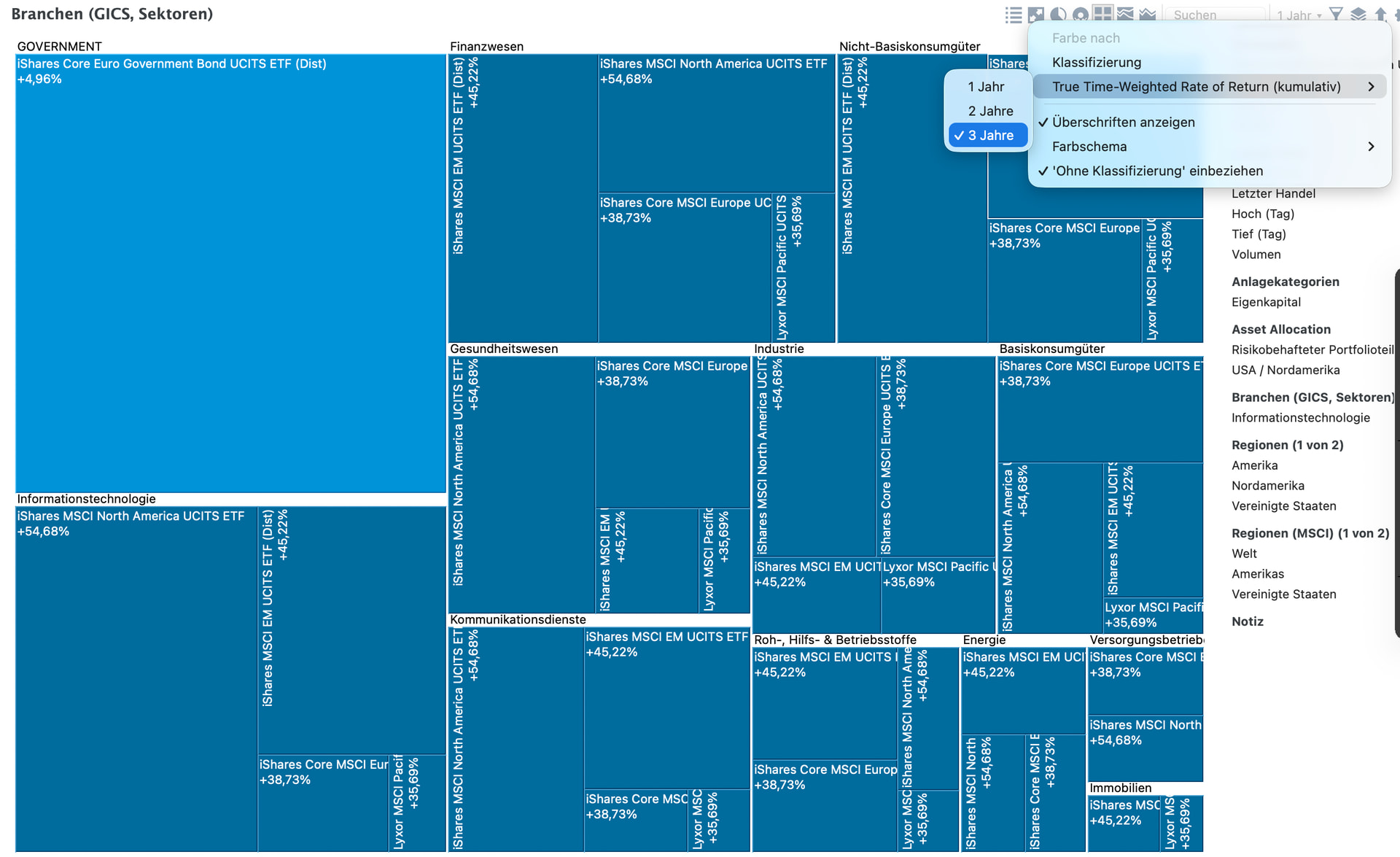
There is already such a tab and display in taxonomies.
So you mean that you want more display options (like the ticker, delta % from previous cotation day, font, etc..)?
As @Sn1kk3r5 and @octy point out, you can get such a view in the “Taxonomy” view. In the upper right corner, choose the reporting period for performance.
Size of box = valuation
color of the box = performance.
Thing is - you need the instruments classified. PP does not know on its own the classifications. If you are happy to use python as a took, check out this thread: