I am using Portfolio Performance with EUR as base currency.
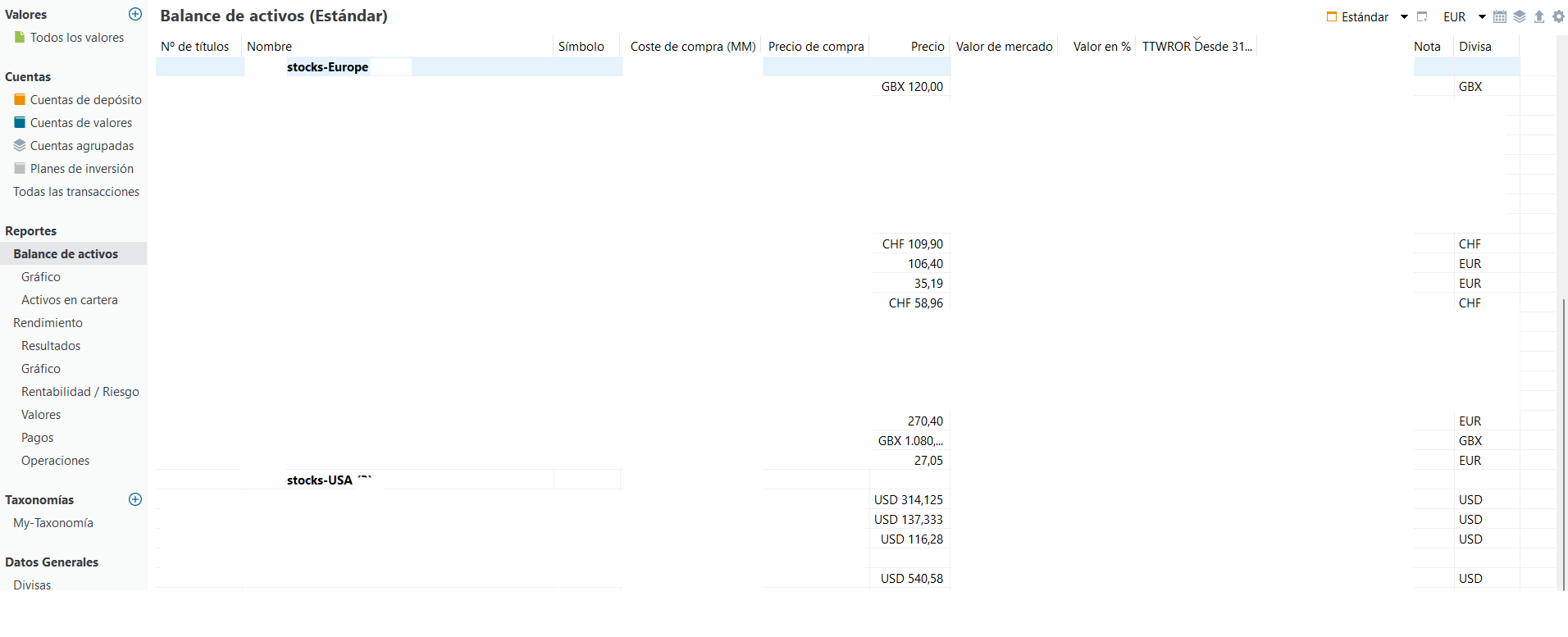
In “Reports → Asset Balance” I can already see that each security (see image below) has its own
native currency (EUR, USD, CHF, GBX, etc.) and that PP correctly converts everything
to EUR for valuation purposes.
However, I would like to visualize the portfolio exposure by currency, for example:
EUR x %, USD x %, CHF x %, GBP/GBX x %, aggregated across all securities.
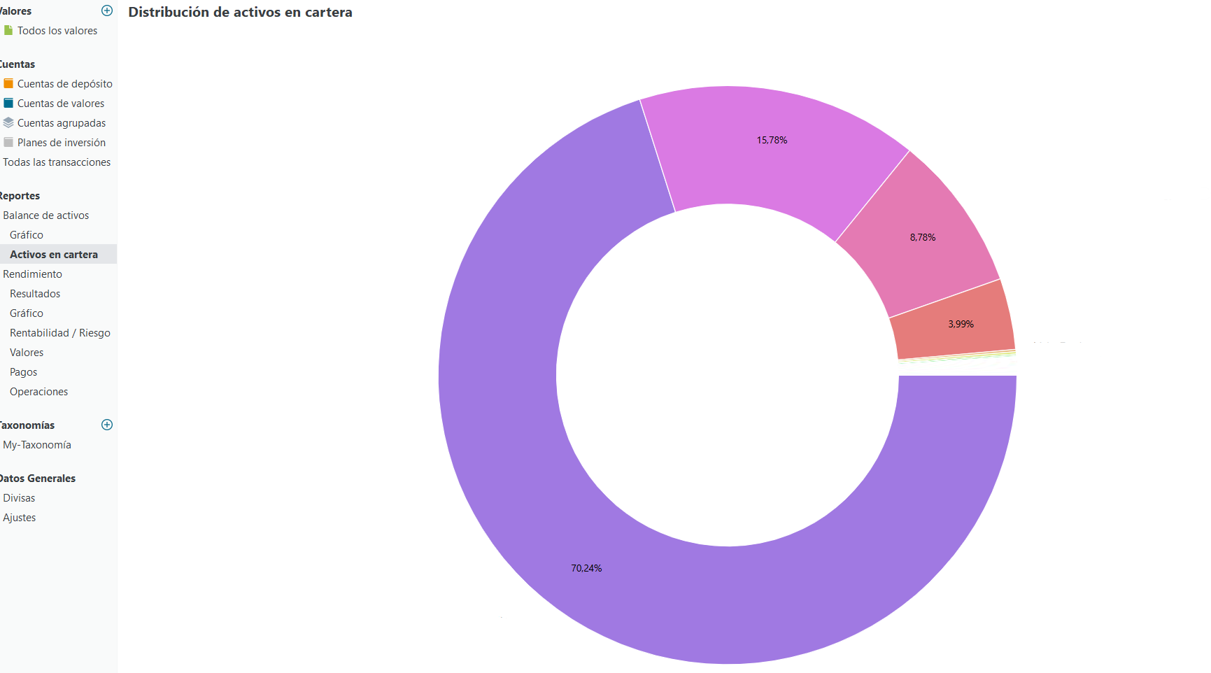
Ideally this would be a chart similar to the “Asset Allocation” donut (see example image), but grouped by currency instead of asset.
Even though I always buy foreign securities from a EUR cash account, I understand
that currency exposure comes from the securities themselves, not from having
separate cash accounts.
Is there any built-in way to do this today (chart or report), or a recommended
workaround using taxonomies?
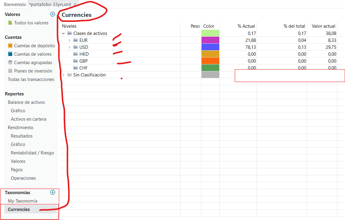
After your assignment, you can double check via statements of assets, just use your newly created taxonomy. (Top right corner) This view will group each currency. This way you’ll easily see if you assigned everything right.
As described here I do the same thing, manually. However as every instrument needs a currency in the “Security Master Data” properties, there is an opportunity that it could be established automatically.
As a feature request to the developers, would it be possible to make it automatic, either in Taxonomy or Statement of Assets section.
Technically yes, but since not everyone needs this feature, you would as well need to create an option.
Due to limited developer capacity I doubt this will add a lot of benefit.
I understand. But I think it is important to know what percentage of currencies we have in our portfolio, so, I think we can more control about not overexposure to different currencies and regions.
But thanks a lot again.