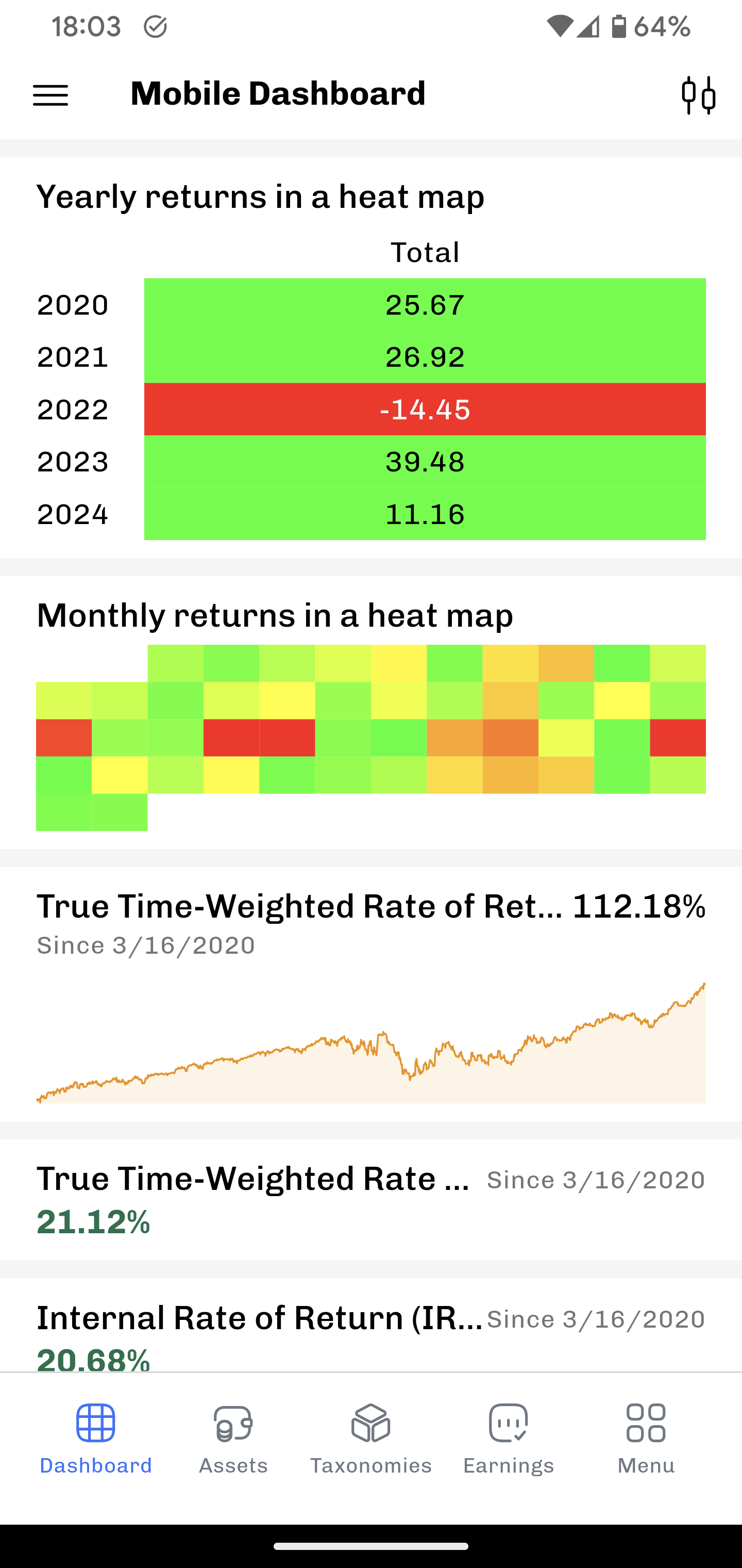
Hi @AndreasB, I don’t know if my comments are still welcome and/or relevant atm, but I was just playing around with the dashboard and noticed the monthly heatmap isn’t displaying the numbers (only when tapping it). Same with the monthly investments.
You’re probably already aware of this, so ignore at your own discretion.
Thanks again for your hard work and the wonderful app it is becoming!
You could make the widget a little higher, and going further to the right by swiping. It’s not much of a widget when it’s showing you nothing unless you tap it. Then it would be better to make it a button or something.
That won’t add space to place decimal numbers there.
That would be and UI catastrophe! And I could already hear the people crying here, that its cutted off.
It is showing you much on a quick view. without any details. For example that 2 years ago something was different and always the October ist different to the rest of the year! If you want details, you have to drill in by clicking it! That’s exactly the sense of a heat map widget!
As Jo92 already said, the dashboard is there to give you an overview.
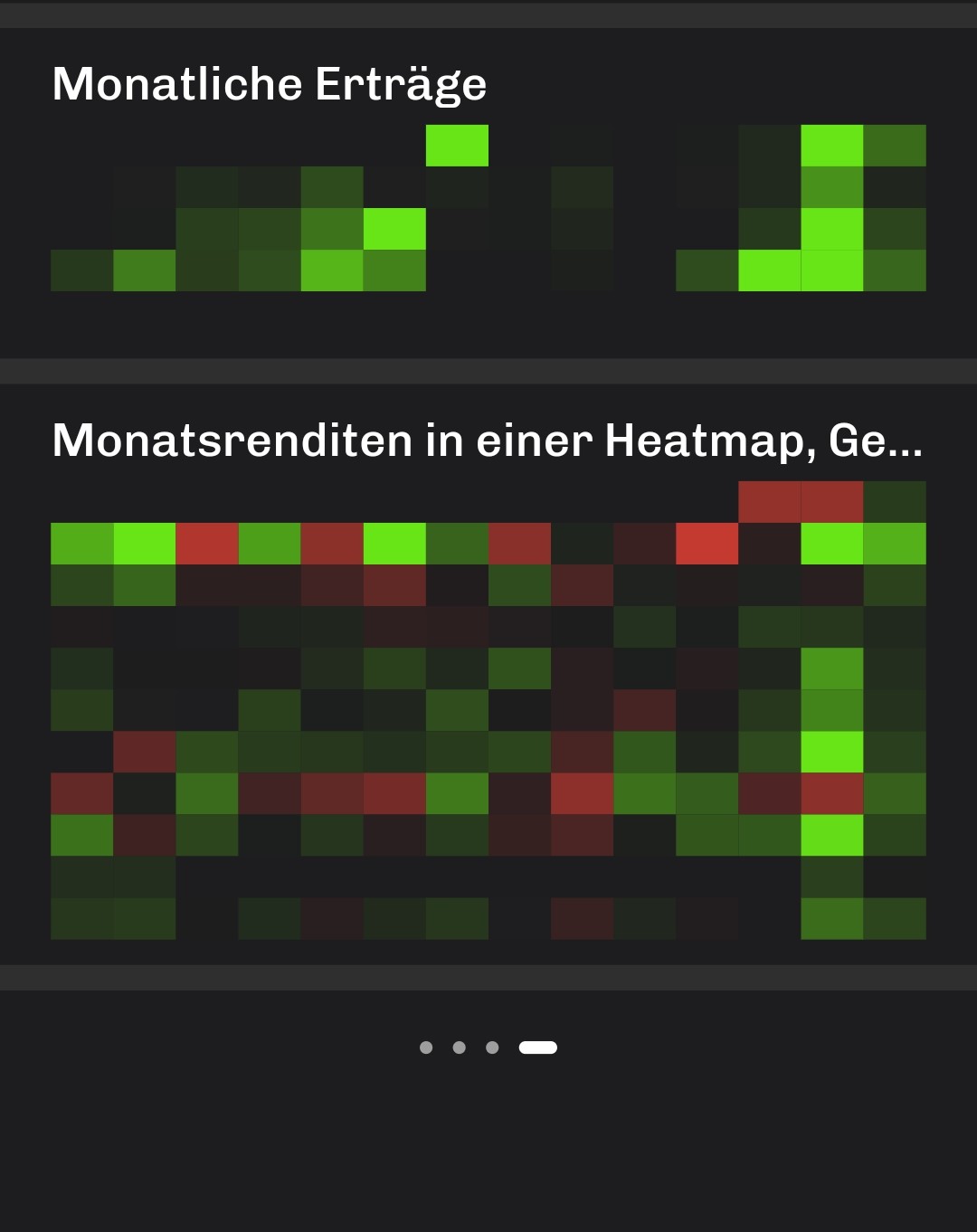
As example: My heat map begins in 2015 and has the additional information such as standard deviation and monthly average which means even more columns and rows. I can see October is always a bad month for me. For more information I have to consider other views either way.
Displaying the numbers in this case would make this small heatmap unusable.
It would be much better to implement a separate tab for the heatmap in stead of crowding the dashboard with it, imo. Other mobile apps do it like this too. People (including me) like beautiful visuals. This heatmap in the mobile dashboard is far from beautiful.
Fair point. I also do not think the heat maps are perfect yet.
If there are few data points, it is an empty space
If the device is big enough (say tablet), then it would be no problem to show numbers
Making the font too small makes it look the phone is dirty - and it also is confusing if I only show the numbers if they fit, e.g. drop the bigger numbers.
I was wondering if it helps to show the values (plus including the legends - month, year) if one taps and holds. This way one can explore the data without leaving the dashboard.
I thought about that too. I did not go for it yet, because the heat map needs configuration (which data series) and the dashboard is a place where I can hold this information at the moment.
Thanks for the discussion and input here - I’ll continue to explore.
I’m not sure how tap and hold could show you the same thing tap does at the moment. Leaving the dashboard isn’t the problem for me, it’s the visual clutter. I know it’s hard to strike the right balance between content and aesthetics, and I thank you for your understanding and great work @AndreasB !