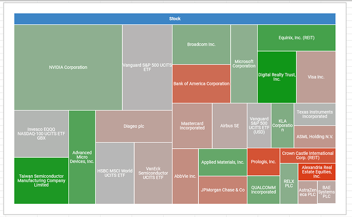
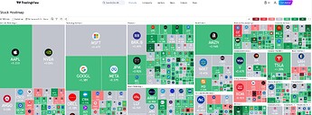
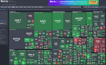
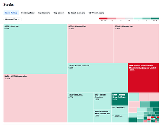
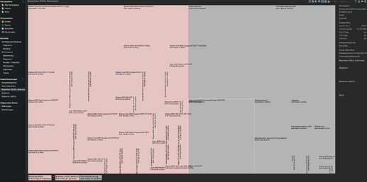
Is it possible to add a new chart type for tree maps? Various tiling algorithm implementations are already available for java/python. The “performance → securities” section of PP already has enough data to produce tens of useful tree maps. One can copy paste this to google docs and create a tree map there with a simple click:
a- Simplest implementation (single tree - one ancestor i.e: stock):
For a starter I’d like to see an allocation of all assets by size (single tree) colour coded by daily gains. Min, max and mid levels should be auto calculated, but there has to be an option to manually override for sane colour coding purposes (i.e 3% max, 0 mid, -4% min)
b- Low complexity, configurable data (single tree - one ancestor i.e: stock):
But I think once the tiling algorithm is implemented, it’d be trivial to change data source for “label”, “source”, “colour” and “hint” configuration options.
So if we wanted to recreate option a with this configuration:
label: Instrument name
source: market value
colour: Daily delta %
hint: Daily delta %
or another useful option:
label: Instrument name
source: absolute performance
colour: TTWROR %
hint: TTWROR %
c- Complex implementation (multi tree, multiple parents often nested)
In addition to data sources, a tree-map can be multi level. (Taxonomies?)
