Hello all,
Brand new to the forum and recently started using portfolio performance (and the mobile app) and so far I’m really liking it. I just wanted to see if anyone else is having this issue with their ‘Performance Chart’ on the mobile app.
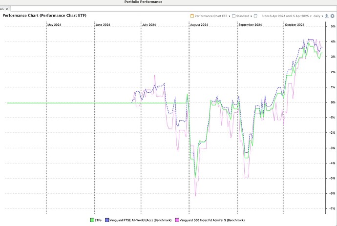
As you can see on desktop I have the benchmark lines as ‘dash’ and ‘dot’. Moreover my primary line (ETF) is set as the 1st/top layer (ie at the front of the 3 lines).
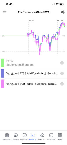
However when observed on the mobile app; the two benchmark lines are solid and the ETF line is at the back so it’s hard to see. Any suggestions? Everything is up to date and I’m using the most recent version of my portfolio on my mobile.
Cheers.

