Noob here,
I just started use portfolio-performance, i’m having some issues with the graph.
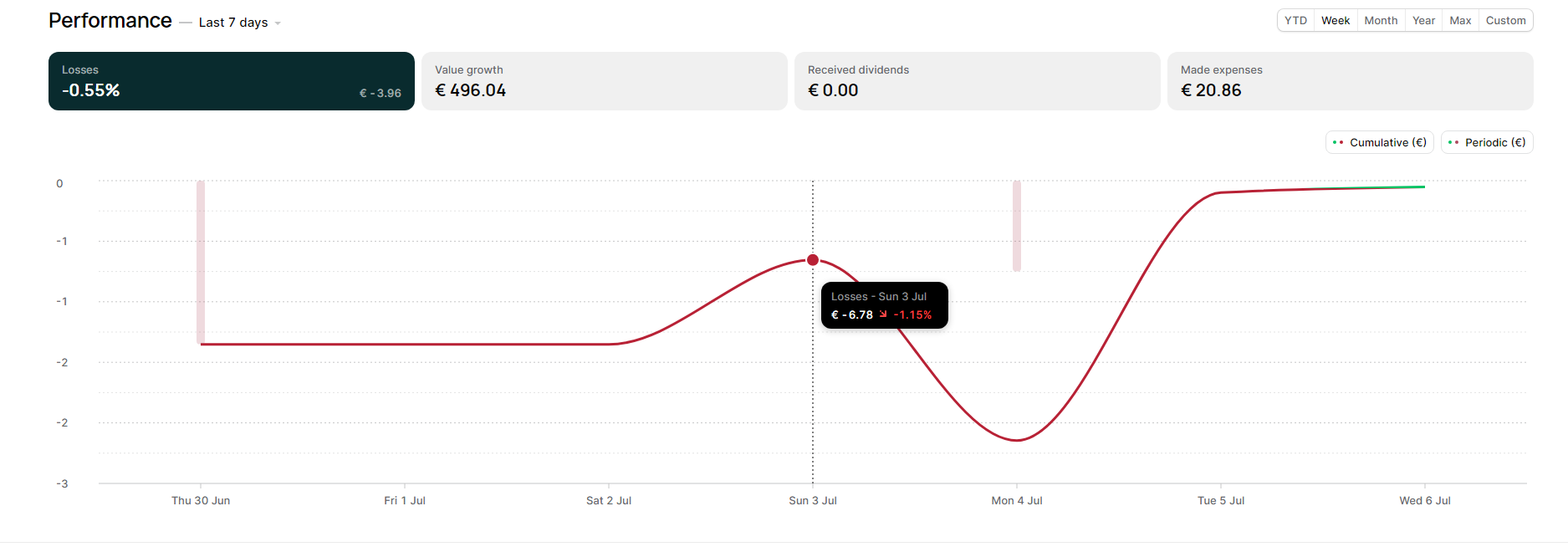
This is what i’m expecting:
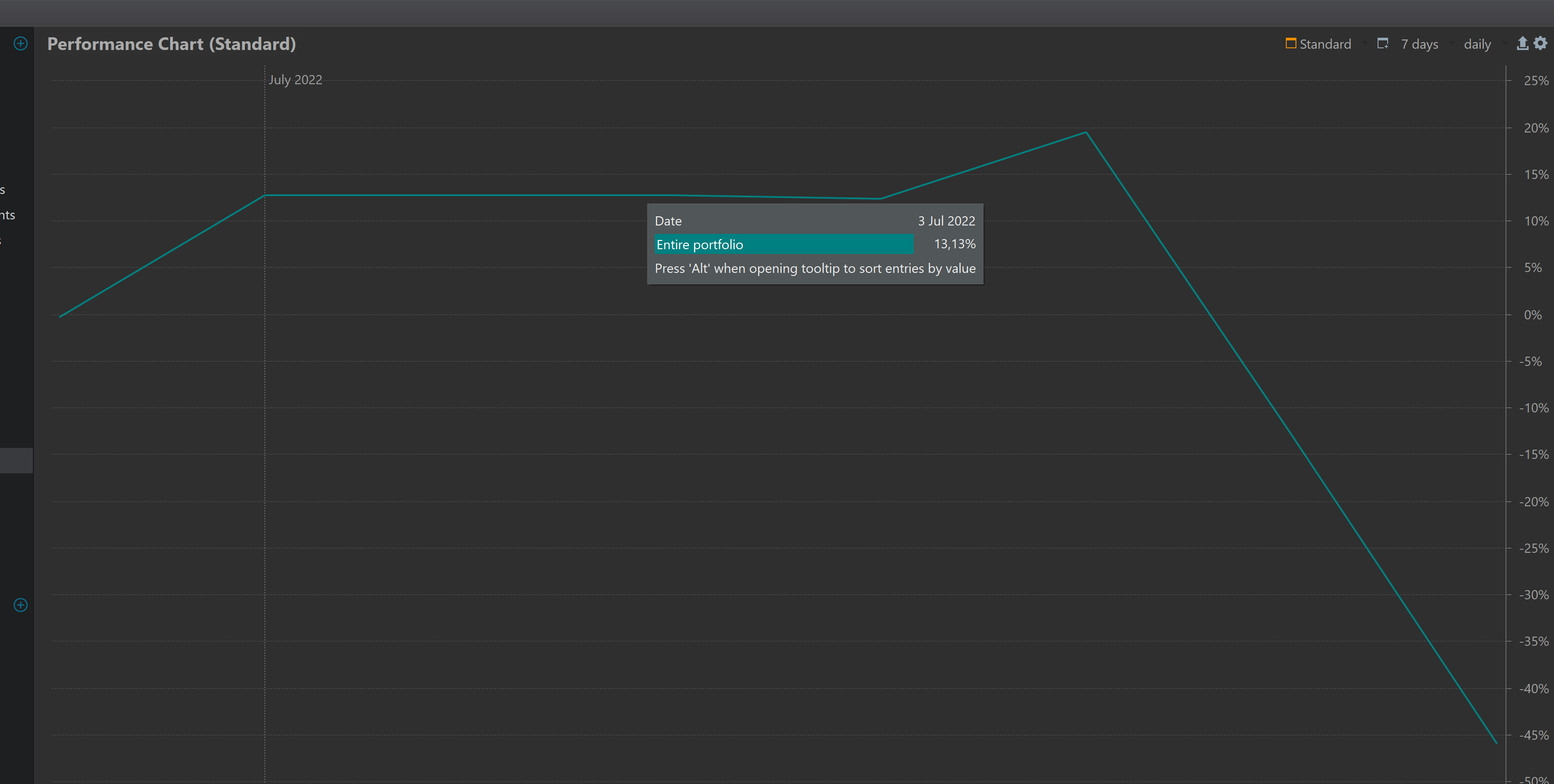
but this is what is shown:
As you can see the curves are not that pretty, and the values does not match exactly.
How can i better the graph with euro value?
I’ve checked if the historical data is the same. They seem pretty close to me.
It is really tough to answer without any details - what is the data and algorithm of the first diagram, what is the actual data behind the second diagram.
If you click on the “export” button in the upper right corner, you get a detailed day-by-day calculation - of what where the valuation and the change to previous day. Maybe that helps to understand the difference.
Ok. So the performance chart is indeed using the historical quotes to plot it (in combination with my amount of shares)? I did an import from De Giro and i had to add the symbols for the quotes my self.
This part i don’t understand: it plotted the chart before the historical quotes were added manually.
I want to understand what the second graph is doing.