It would be great if the lines in the portfolio graph would have the option to be stacked (or have a separate graph that works this way)
In addition to stacking it would also be nice if there would a choice to used a stacked bar graph. The way I envision it you would choose a granularity week/month/year and the values of the bar would reflect the end of that period. This way you could see if one would use aggregated categories like cash/stocks or accounts of different brokers etc, how the composition of the protfolio changes over time.
Naturally it is left to the user to select the categories of the graph such that the stacking makes sense (and a part of the porfolio is not included multiple times in a stack)
Hello, there are stacked charts in the Taxonomy section:
Stacked bar charts I think it is not implemented.
That is not what I mean. And I want to stack the lines (or bars) based on the things you can have in the portfolio graph, typically the different accounts. And as is possible in that graph enabling and thisabling them by clicking in the legenda.
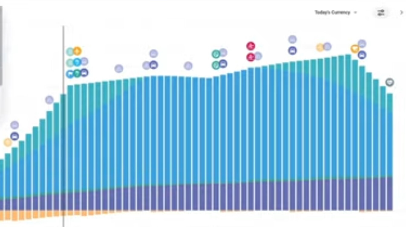
With stacked I mean added on top of each other. So the each line is its value above the line under it. So the total area reflects the total value.
And with bars you get something like this (disregard all circles ![]() )
)