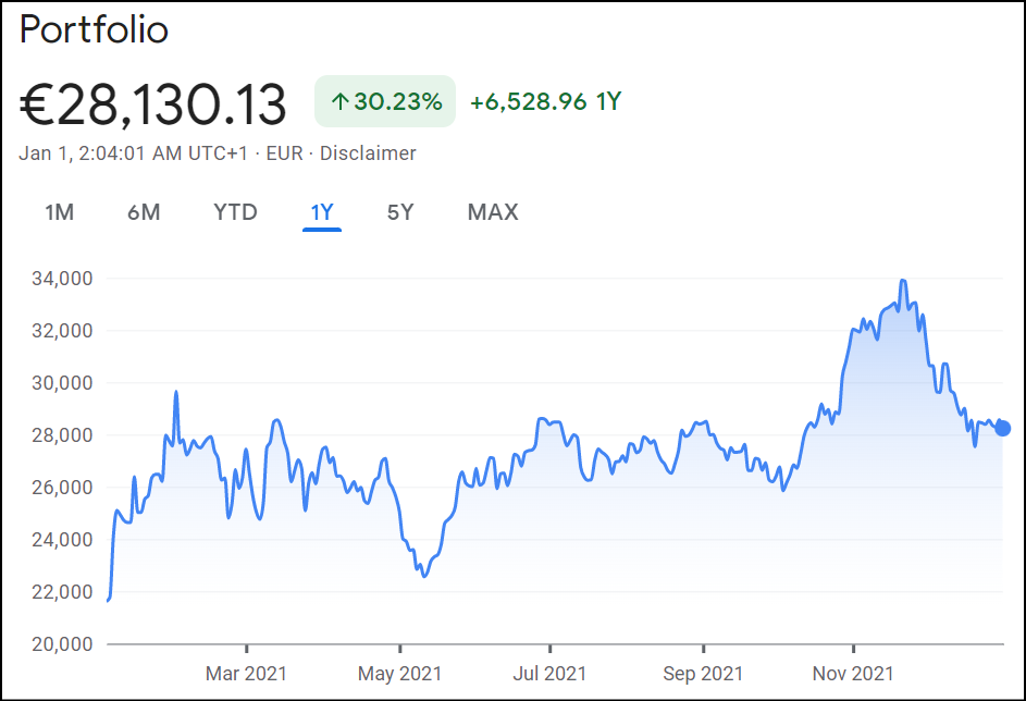
There is something I can’t wrap my mind around as I compare the Performance chart from PP and my portfolio in Google finance. Bear in mind that in 2021 I made one trade to buy a stock for 4k in February and it is at -21% rn.
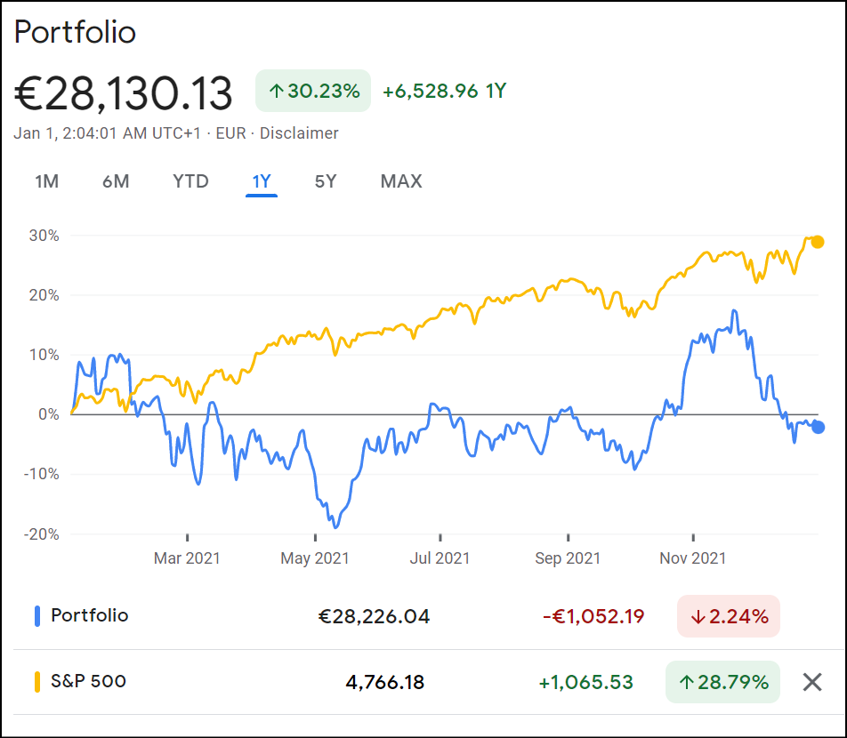
And in PP:

Degiro has a really aweful dashboard that is just tragic for calculating the yty returns or IRR TTRWR. According to my quick calculations I finished this year with -1.33% (yey fu*king me)
Is it possible that the first image thinks that the money I spent to buy the stock (4k) is priced in the +30%? However if we discard the money invested and we only look at the -21% loss then my pf is at -1 or -2%?
Thank you!