I love this software, and I learn how to use it for months now and I am still learning new things. Thanks again to the developers
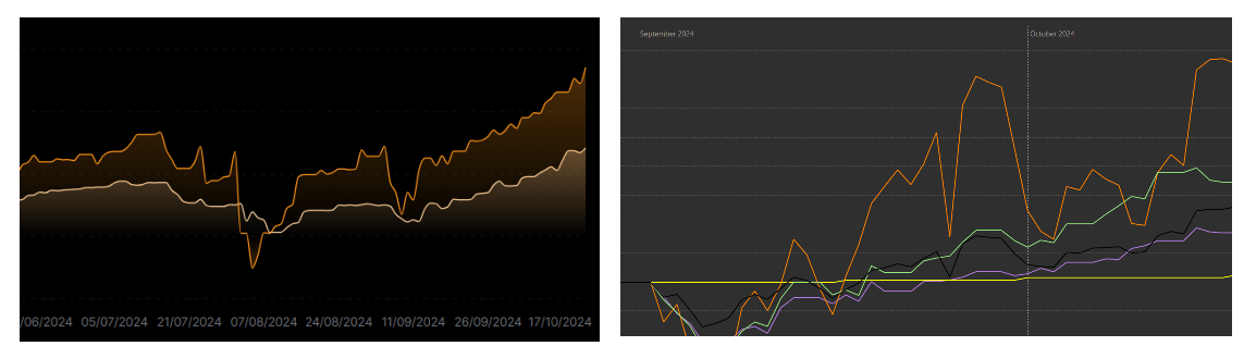
One of the things that have been tickling me is the charts, which seem too sharps. Not too sharp to be true, but to be beautiful. Most people like to have a pretty graph, and it can be important for a more massive adoption of this software I believe. To have a comparaison, on the left there is a graph from Finary platform, and on the right from PP:
Do you believe there is a way to implement this? I tried to look at the git but I’m just a scientist who knows how to smooth a chart on python, it seems simple on paper but maybe it is more complicated that it looks.
Hey Hibou,
as a scientist you should be happy that PP does show the existing values only and does not invent fake data in between the data points. Smooting charts is for everybody but for scientists … except you know which mathematical behaviour is behind the data points.
Hibou wants beautiful graphs, i.e. some behaviour of the graph between the data point, aka faking graphs.
Connecting data points by straight lines is as far as one should go with graphs even though it is not theoretical correct as well … but this would be of topic
I assume the soft gradient fill bottom up is intended, but this is highly challenging and resources expensive as it’s not a standard of Java SWT. Developer resources are also rare.
The graph on the left is over 4 months vs 1.5 months on the right. 1.5 months is quite short. With >1 year of data, the sharpness it is not noticeable anymore for me.
I think at some point there was an idea of an PP API to be able to adapt the design, and chart also I think. There was a recent contribution I think in issue #2478.