In the latest version, you can add a unit risk line to the ‘Return/Volatility’ graph. I don’t understand what this means.
Thank you for your help.
dregnier
In the latest version, you can add a unit risk line to the ‘Return/Volatility’ graph. I don’t understand what this means.
Thank you for your help.
dregnier
Does this helps you?
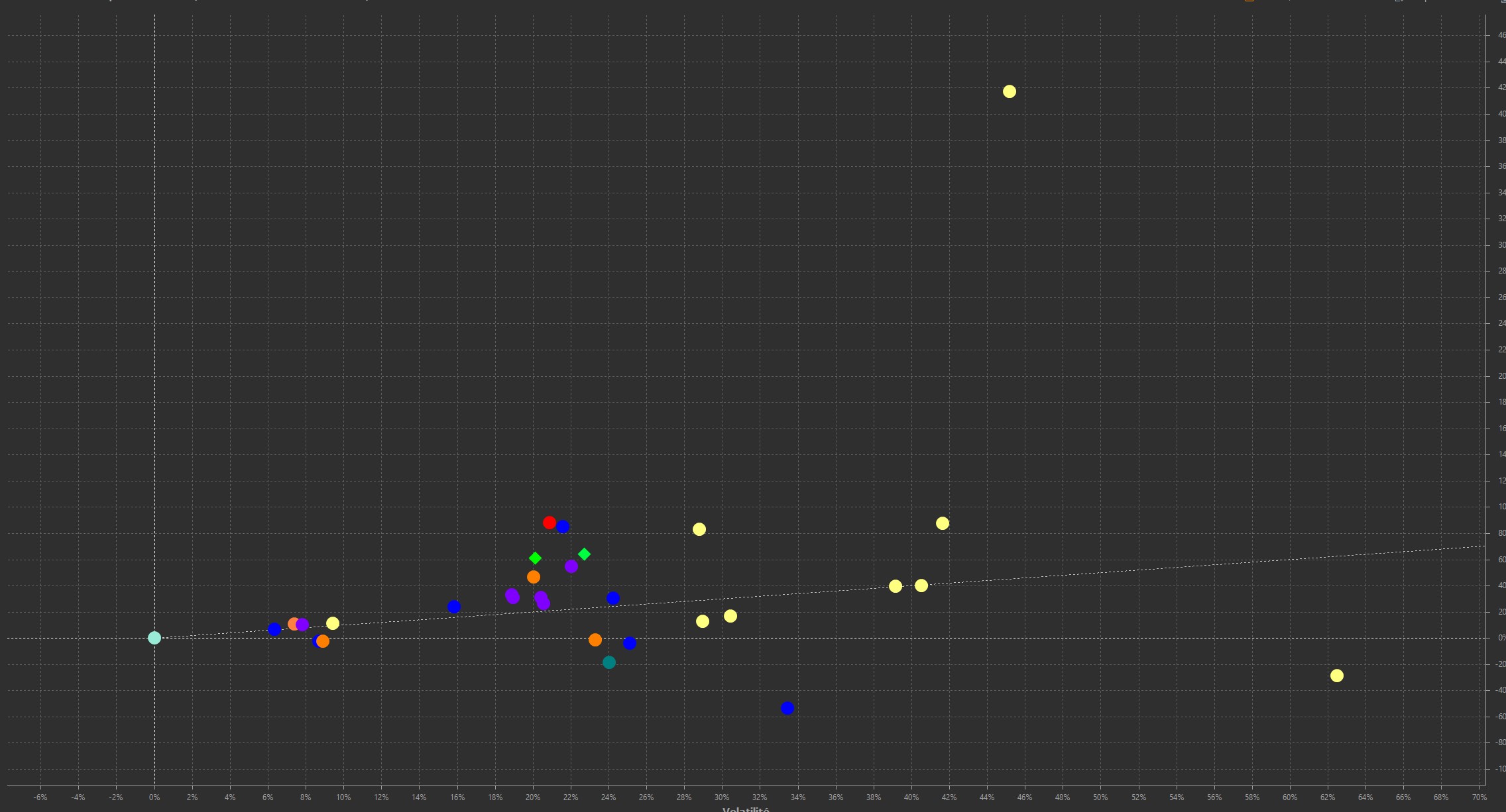
I saw this screenshot but I don’t understand what this risk line is for…
I’ll add this screenshot:
- Yellow and blue dots: my shares (PEA and CTO)
- Purple and orange dots: my ETFs (PEA and CTO)
- Green diamonds: SP500 and MSCI World benchmarks
And the unit risk line that starts at zero and ranges between 60% and 80%
How should this be interpreted?
In short: All above the line is good stuff - the things under the line maybe not.
OK, thank you! It was actually quite simple ![]()
And can you tell us how the path of this line is calculated?
I forgot to mention that this is just my assumption. Sorry. I think the line is supposed to represent the capital market line. https://www.investopedia.com/terms/c/cml.asp
No.
@ProgFriese Thank you for your feedback, but after reading the Investopedia article, I am unable to say whether the line in question is the ‘unit risk line’ or the ‘capital market line’ (??). Translated from English by my browser (Vivaldi), the article is very convoluted and almost incomprehensible.
I’ll wait for @Lotendan to shed some light on this subject…
You need to ask this wuestion on Github since the developer is not in this forum.
Without looking at definition “out there”, here is my interpretation. Every asset you own has a price range it’s going up and down over time which is called volatility. The higher the volatility, the higher the risk but also the higher your personal gain (or loss for that matter) can be. For every volatility-value you can calculate a medium value of expected profit or loss that results into a line in a diagram with the volatility on the x- and the expected medium gain on the y-axis. If you now plot the actual gain of your position into this diagram, you can see if a particular value performed better than to be expected or worse.
Everything above means that it performed better than the expected average, everything below means the contrary. A line alone isn’t enough, though. What you’d need is the range of maximums and minimums expected values where the minimum often goes far into the negative range for higher volatility values. On said diagram this would show as a corridor around the line becoming wider the higher the volatility-value is. All your plots are most likely within that corridor.
@kimmerin Thank you for taking the time to share your interpretation with me. The idea of a ‘corridor’ is interesting, but unless I am mistaken, the ‘unit risk line’ does not offer this possibility of a ‘corridor’.
If other contributors would like to give us their interpretation or, better still, tell us what is really going on, they are welcome to do so. ![]()
IMHO @kimmerin does an excellent job of summarising what the chart is meant to show. The chart ought to be considered in the context of being a visual aid and what it conveys is going to differ, possibly substantially, from one person to the next given that attitude to risk varies considerably – its immensely personal and circumstances change.
I feel the ‘risk line’ builds upon and enhances the chart’s visual impact, making it easier to identify investments that fall within our own acceptable risk/return range. The risk line acts as a barometer, indicating whether an investment is achieving an appropriate balance in respect of this risk and return. It’s entirely subjective, but those that are clustered near to this line, what @kimmerin possibly means by saying ‘corridor’, could be considered as achieving this. By extension, investments plotted away from this line are less likely to meet an investor’s acceptable risk/reward criteria.
@Rich28 Thank you for your contribution. It complements @kimmerin’s contribution and is along the same lines.
If I understand correctly, assets located around the unit risk line correspond to its risk/return balance.
Question: how should those located well above this line be interpreted?
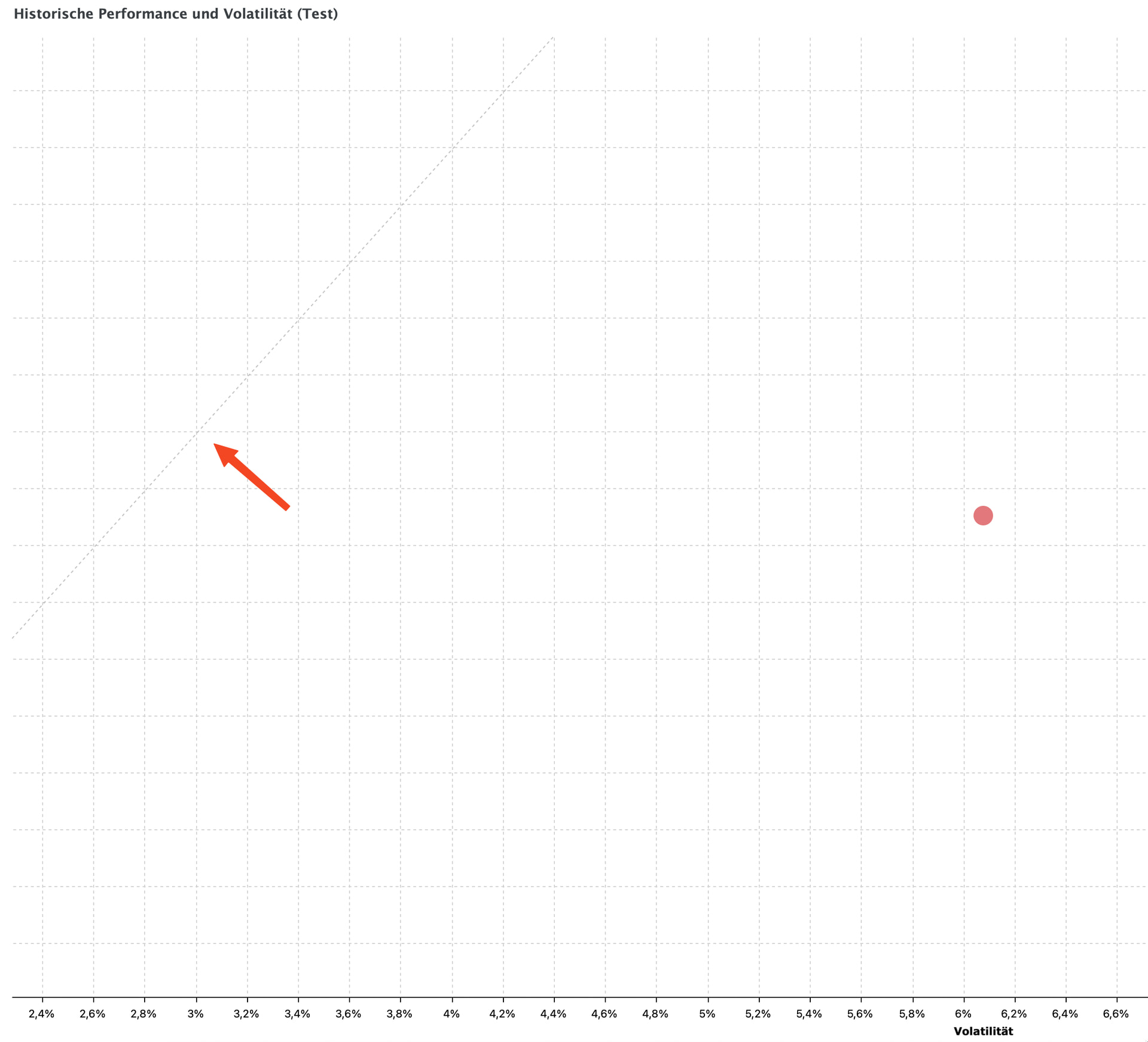
I applied the risk line to the evaluation of a single security (see screenshot). I would have expected it to pass exactly through this security in this case (since this is the only risk involved). However, it does not. How should this line (and the position of the security relative to this line) be interpreted?
Ich habe die Risikolinie auf die Auswertung eines einzigen Wertpapiers angewandt (siehe Bildschirmfoto). Erwartet hätte ich, dass sie in diesem Fall genau durch dieses Wertpapier führt (da dies das einzige vorhandene Risiko ist). Tut sie aber nicht. Wie ist diese Linie (und die Position des Wertpapiers zu dieser Linie) nun zu interpretieren?
.
@Magellan … Interesting test with a single asset. I scanned a few of mine and unfortunately I can’t draw any conclusions from them. With some of them, when you scroll, the unit risk line moves up, down, left, etc. It’s difficult to draw any conclusions from this.![]()
The line is based on the asset’s volatility while “your point” shows your gain which is based on the asset’s aquisition price.
But I think there is a bug concerning that line. See my other thread over there for details
Ich musste auch erstmal googeln, was diese Linie mir jetzt sagen möchte. IMHO ein Binsen-Feature und meistens ist die Linie auch noch irgendwo (nicht sichtbar).
Ich würde mir mal als sinnvolles Feature die Anzeige eine anualisierten Vola und Sharpe Ratio im Dashboard wünschen um nicht immer manuell ne Wurzel ziehen zu müssen bei Berichtszeiträumen > 1J ;).
Vola und Sharpe Ratio p.a. habe ich bisher manuell so berechnet (Die Werte sind aus dem Dashboard: Volatilität über die letzten 10 Jahre und der IZF):
>>> cagr=8.5; stddev=42; years=10; volapa = stddev / pow(years, 1/2); sharpe = cagr / volapa; volapa; sharpe
13.281566172707192
0.6399847645578863
Regarding the “risk line,” has the developer provided any information on what exactly the risk line is supposed to indicate and how it should be used or interpreted? Opinions on this vary considerably in the German and English forums.