Hello,
I am using PP on Linux (Arch linux) with Orca screenreader - I am blind. Most of various screens in the app are very well accessible - probably because they are shown as lists / tree views. I mean for example list of transactions, calculations etc. But the performance dashboard (prety important) is not easily readable. Would it ber possible to either make it more accessible (not sure how to help) or to export the performance dashboard as some CSV or something?
Thanks.
In what way is accessibility bad? Does the screenreader not find anything to read at all, or only parts of the content? Is it an issue with ordering, where the screenreader reads elements in sequence that don’t belong together? (E.g., first all widget headings, then all widget contents.) Or is there clutter, drowning the relevant content?
1 Like
Hello,
these are great questions, I will try to answer.
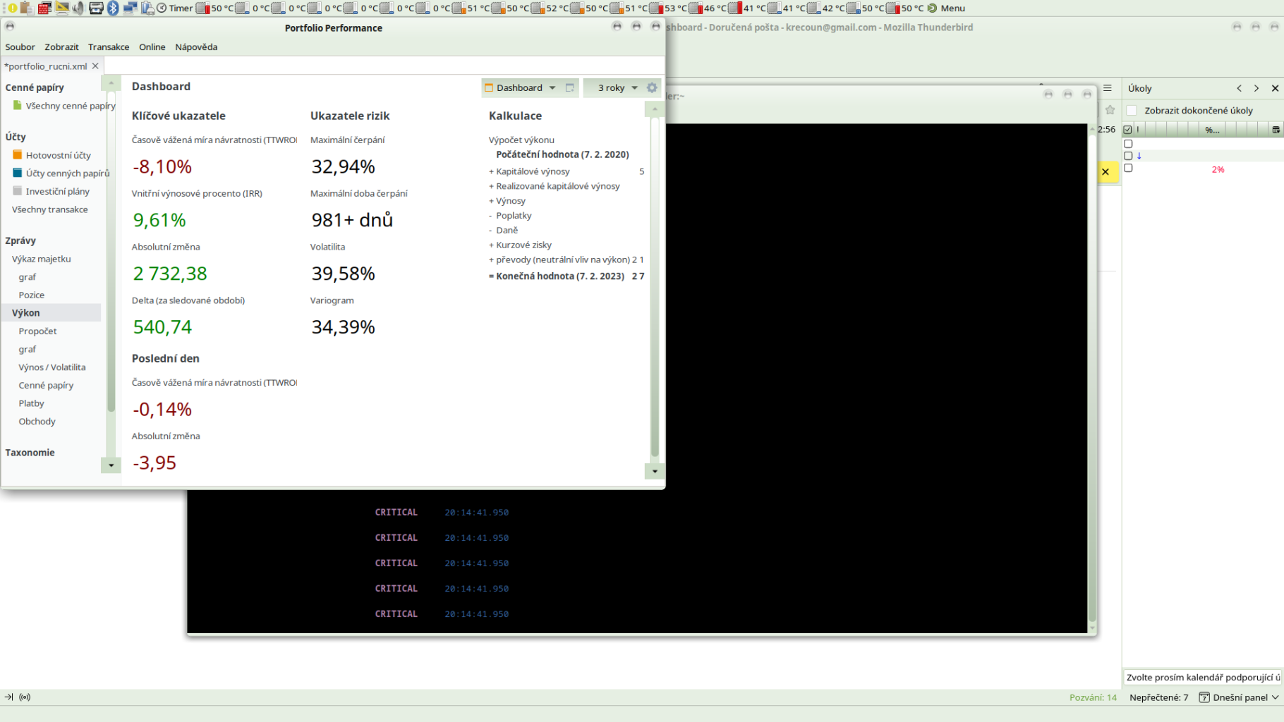
Some things are read, but the following are not - sorry for possibly bad translation because I have the interface in Czech:
Internal gain percent (IRR) - there is no number shown to the screenreader, instead it reads “maximum drawing period”
Then the row “delta for watched period” - there is no number, it just reads “variogram”.
Then "(TTWROR) " is without a number
And the last row “absolute change” is without a number.
2 Likes
Hi @krecoun,
great to have you here! From you’re description I would assume, that the Screenreader is not reading the numbers. For you’re information: The Dashboard is build with configurable widgets, which are each composed with a header and a number or diagramm. But the dashboard is a visual representation. To be honest, I am not sure if that is the best form of representation for you (of course I agree with you that it would be welcome if you could use it in the same way. But I don’t know if it’s just as helpful read aloud).
Maybe we could also help you, if you tell us which information you’re searching for.
1 Like
nBut some other numbers are read correctly, e.g. realized capital gains. Only parameters I have mentioned above are not read.
Ok, that is an important information. Then somebody needs to check it in the sourcecode. May there are different codings used. I am not a developer and not able to do that.
But regardless of this I would suggest to don’t use the dashboard if you’re not able to “see” visual informations. From my point of view, that add not so much value for you.
Hello, do you think I could get information about performance of the portfolio at some other place than dashboard? If yes then please let me know. I am interested in usual metrics - ROI, annualized ROI etc.
OK, so it seems that it both ignores some numbers and sometimes reads text from the second column instead (“maximum drawdown period” and “variogram” is from the second column).
The numbers in the first column all happen to be coloured (green for positive numbers, red for negative numbers). You didn’t mention the widget at the top (“Časově vážená …”), is its value being read? It is -8.10% in the screenshot, and coloured red because it is negative. If that one isn’t read, either, my theory would be that the colour might be the problem. If it is read, that would be that theory killed.
Hello, yes the part is read, but it does not read numbers.
It reads:
Časově vážená míra návratnosti (TTWROR) (kumulativní) Maximální čerpání Výpočet výkonu
I will post you actually everything that is read on the screen.
Klíčové ukazatele Ukazatele rizik Kalkulace
Časově vážená míra návratnosti (TTWROR) (kumulativní) Maximální čerpání Výpočet výkonu
Počáteční hodnota (9. 2. 2020) 0,00
- Kapitálové výnosy 539,31
- Realizované kapitálové výnosy 0,00
Vnitřní výnosové procento (IRR) Maximální doba čerpání - Výnosy 4,04
- Poplatky 4,81
- Daně 0,60
Absolutní změna Volatilita + Kurzové zisky -0,01
- převody (neutrální vliv na výkon) 2 191,64
= Konečná hodnota (9. 2. 2023) 2 729,57
Delta (za sledované období) Variogram
Poslední den
Časově vážená míra návratnosti (TTWROR) (kumulativní)
Absolutní změna
The fact that both columns are read is OK - that’s how this feature of the screenreader works, no problem. But I am missing the numbers ![]()
Indeed, the colored numbers are drawn with a slightly different widget (essentially allowing a simplified HTML syntax to color parts). I will check where I can set a textual representation that then can be read by screen readers.
5 Likes
I had already done some research about that, resulting in this pull request:
5 Likes
Umm, it somewhat destroys the logic, because the columns are meant to be read columnwise. ![]() So, for example, as soon as the issue with the numbers is fixed, it would presumably first read “Delta (za sledované období)”, then “Variogram”, and only then the value for Delta followed by the value for Variogram.
So, for example, as soon as the issue with the numbers is fixed, it would presumably first read “Delta (za sledované období)”, then “Variogram”, and only then the value for Delta followed by the value for Variogram.
But I guess you could just put all widgets into a single column, and then everything would be read in the correct order. Having multiple columns is only useful for visually organizing the data, I guess.
@krecoun With Version 0.61.1 we set accessibility information (thanks @chirlu for researching). Please let us know if you have more issues detected.
2 Likes